Don’t Hit the Medicare Revenue Wall: What You Must Know About 2016 PQRS-VBPM Benchmarks
 What will it take for health care providers actually to focus on improving patient outcomes, while keeping costs under control? CMS has structured quality reporting under the Value-Based Payment Modifier (VBPM) to reward providers who surpass PQRS measure benchmarks, and penalize those who lag behind. But inherent in the new quality tiering is a serious dilemma: a strong incentive to game the system, rather than to improve performance in any meaningful way.
Here’s why: For three-quarters of the individual measures included in these benchmarks, it is statistically impossible to surpass your peers’ performance. The only way to differentiate performance is to identify and report on measures for your quality composite that don’t have statistical boundaries. But while that may improve your positioning, it doesn’t help your patients—which should be the real goal.
How the VBPM Incentive-to-Penalties Distribution Really Works
At the end of 2015, CMS released their 2015 PQRS measure benchmarks, based on their compilation and analysis of all 2014 data. The release of these results is intended to help groups understand how the measures they’re planning on reporting for PQRS will score compared to others across the country, which will tie to their reimbursement rate, via the VBPM.
The VBPM uses (among other things) the performance rates from groups’ PQRS measures to determine quality composites. The underlying reasoning goes like this: if a group has selected appropriate measures for fulfilling quality reporting requirements, Medicare is justified in using those measures to calculate a quality score. Overall quality scores that exceed Medicare’s average by at least one standard deviation put the group in position to be “tiered up,” meaning they’ll earn an additional incentive payment on all Medicare Part B revenues. Those on the other end of the spectrum will be “tiered down,” meaning that their Part B reimbursement may be reduced to 96 percent of what others are reimbursed for the same services.
But the payment methodology is not that easy. Those who do not fulfill PQRS reporting requirements are penalized automatically for both PQRS and VBPM, meaning that more people will be penalized than will be rewarded. As long as there are providers who continue to fail PQRS, incentives and penalties cannot be distributed equally, since these programs must be budget-neutral. In other words, people who are tiered up are paid from penalties accrued from those who are tiered down in VBPM and who are penalized for not reporting PQRS.
It’s Not Enough to Perform Above Average
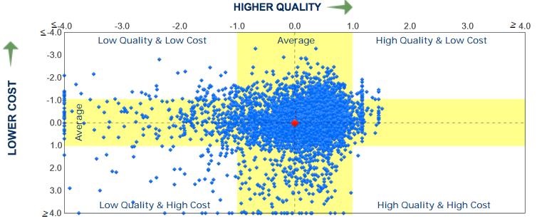
This imbalance between under-performers and over-performers is illustrated in the graph below. Drawing from a sample CMS Quality and Resource Use Report (QRUR), the scatter chart shows that the population is skewed, and that many more people were penalized in VBPM (even among those who reported for PQRS) than rewarded. Note how the dots (representing individual groups) are scattered all the way to the left—the low quality designation. Now look at the other side—an abrupt stop just beyond the incentive-eligible, high quality range.

How can that be possible? After all, on a “normal” distribution, there should be just as many people on one side of the average than the other, with most clustered towards the middle. That’s why Medicare doesn’t reward or penalize simply for being higher/lower than average. For your performance’s difference to be statistically significant, there needs to be a clear division between you and everybody else.
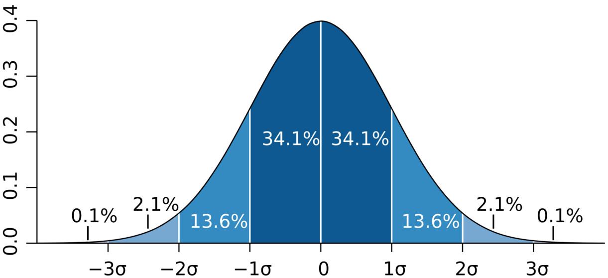
In a normal distribution, shaped like a bell curve, more than two thirds of those in the measurement pool are in that middle area—one standard deviation (shown as sigma in the next graph) from the mean. To be tiered up, you need to have better performance than almost 85 percent of your peers. So why does the QRUR picture above look less like a football and more like a comet?

The answer lies in the individual measures’ benchmarks. At the end of 2015, Medicare released 2015 PQRS Measure performance benchmarks, based on the analysis of all 2014 data. (And herein lies one more conundrum: everyone’s attempts to succeed in VBPM are based on previous data—no one will know the true 2015 benchmark until long after 2015 data has been submitted.) For the measures that could be benchmarked (enough patient volume to make an accurate calculation), Medicare released the average, as well as the standard deviation for each.
Think of the standard deviation as how flat or steep the bell curve appears. If the standard deviation is small, it means that everyone is concentrated around the average, and the bell looks more like a spike. A small change in performance can mean a big change in your position compared to others. By contrast, if the standard deviation is large, results are broadly distributed, and the bell is wide and flatter. So there’s more “wiggle room” before you’ll see financial impacts.
Up Against the Statistical Performance Wall
Here’s where things get even more complicated. Similar to last year, this year’s benchmarks feature measures where the mean plus one standard deviation (the point where the measure pushes you towards VBPM incentive) is actually above 100 pecent. For example, let’s look at a frequently reported measure, #226: “Preventive Care and Screening: Tobacco Use: Screening and Cessation Intervention.” According to the most recently released benchmarks, the average is 89 percent, and the standard deviation is 19.5 percent. So it’s mathematically impossible for a group reporting this measure to be in the “high quality” range (more than one standard deviation above the average) for the Value-Based Payment Modifier—you’d need a performance of 110 percent (89 + 19.5).
The “performance wall” seen in measure #226 is by no means an anomaly. Of the 173 individual measures included in these benchmarks, 127—a whopping 73 percent—have means and standard deviations where performing significantly better than your peers is not possible. It’s the equivalent of chopping off the bell curve just as it begins to slope back down, and before anyone can demonstrate superior performance.
If you’re wondering if any measures work the other way (minimal performance will keep you within the safe zone—one standard deviation from the mean), there are some—but only three. So, we have nearly three-quarters of benchmarked measures whose results, when plotted on a chart, have full tails on the poor performance side, but have an invisible wall blocking the bell curve from extending into the high quality performance range. The comet shape from the sample QRUR begins to make sense (mathematically, at least), given this context.
NQS Domains Make the Wall Even Higher
The National Quality Strategy (NQS) Domain breakdown makes this even more challenging. To succeed in PQRS reporting individual measures (either as an individual or group practice), you need to complete nine measures for at least 50 percent of eligible patients. In addition, those measures (including a “cross-cutting measure”) must represent at least three NQS Domains.
We’ve discussed how the Domains aren’t represented equally, which can make quality tiering a challenge for certain specialties, and the same holds here, too. Of the measures benchmarked in the Person and Caregiver-Centered Outcomes and Experience Domain, there isn’t a single one where it’s possible to achieve “high quality” performance. Since your VBPM quality composite creates NQS Domain composites based on the measures within a Domain, anyone who reports that Domain has made it more difficult move their quality tier to the “high” level. This is the most egregious case, but for the majority of measures in each domain, it’s statistically impossible to achieve “high quality” results.
So, What’s the Best PQRS and VBPM Strategy?
The good news is that the benchmarks are not continuing to rise. While not necessarily at levels that enable positive tiering, the benchmarks also do not make it more challenging (compared to peers) to remain “neutral.” Of the 173 measures that were included in the 2015 benchmarks, the majority actually became more lenient (the average went down for regular measures, or up for measures where lower performance indicates better control): 88 were less challenging, while 59 became more difficult. There were 22 measures where there was no basis for comparison (the measure was either new or did not have a previous benchmark release).
Even so, tread cautiously, as there are always exceptions, and this year is no different. An interesting measure here is one of the original PQRS measures, #7 (Coronary Artery Disease (CAD): Beta-Blocker Therapy—Prior Myocardial Infarction (MI) or Left Ventricular Systolic Dysfunction). Those who have been reporting this measure for years should be wary—it may have served you well in previous years, but if you are on auto-pilot, the pack is poised to move the bell curve’s peak past you, leaving you at risk for future penalties.
So what is your strategy? It would seem that “taking it to the limit” is the only way to stay safe when it comes time to calculate your quality composite under the VBPM. But how can you achieve that goal? The majority of measures have performance/standard deviation combinations that ruin your ability to differentiate yourself.
If you have the opportunity to report one that isn’t in this category, focus on it early so that you can collect the data, improve if you need to, and report it at the end of the year. Do you know how to capitalize? Do you know where you’re at more risk now than previously, even if reporting on the same measure?
At the same time, be equally wary of taking the easy way out. In the long run, those who succeed under Value-Based Health Care will focus on outcome measures that truly distinguish performance. Providers must become deeply engaged in the process and not pass off quality efforts to office managers and other administrative personnel, or rely on clever statistical analysis to choose performance measures that improve quality tiering but don’t really change how health care is delivered.
PQRS used to be a simple and voluntary endeavor, but those days are gone. If you do not have a Registry partner with the experience and skill to help guide you through this uphill slog, get ready before the competition leaves you behind.
Download your free copy of our new eBook, ICLOPS Value-Based Payment Modifier Primer: How NOT to Forfeit Your Medicare Revenues.
Founded in 2002, ICLOPS has pioneered data registry solutions for improving patient health. Our industry experts provide comprehensive PQRS Reporting, Value-Based Payment Modifier and Performance Improvement Technology and Services Solutions that help you both report and improve your performance. ICLOPS is a CMS Qualified Clinical Data Registry.
Contact ICLOPS for a Discovery Session.
Photo Credit: George Harpwood